
- Published on
[회고]일주일에 디자인 시스템을 세 번 갈아엎은 이야기
- Authors

- Name
- Nostrss
- Github
- Github

이번 편은 회고 같은 글이다. 며칠을 들여 만든 디자인 시스템을 같은 주에 뒤집은 이야기이다.
Phase 1: Apple DESIGN.md      — getdesign.md 에서 다운로드
Phase 2: Pegman 캐릭터 시스템  — 백지에서 자체 제작
Phase 3: shadcn 프리셋        — 표준 프리셋 채택 (지금)
첫 번째 시스템 — getdesign.md 에서 받아 온 Apple DESIGN.md
나는 디자이너가 아니다. 그래서 처음에는 디자인 시스템을 직접 정의하는 대신 다운로드했다.
DESIGN.md 는 최근 구글이 발표한 형식이다 — 디자인 패턴·토큰·규칙을 마크다운 한 장에 담아서, AI 코딩 에이전트가 일관된 고품질 UI를 생성하도록 돕는 명세 문서다. 발표를 봤을 때부터 한번 실제 프로젝트에 적용해보고 싶었다.
마침 getdesign.md 라는 사이트가 있다. Apple, Stripe, BMW, Figma 같은 유명 브랜드의 디자인 시스템을 이 형식으로 정밀 분석해서, AI 코딩 에이전트가 그대로 먹을 수 있는 형태 — 색 토큰, 타이포 스케일, 컴포넌트 규칙, Do/Don't 까지 담긴 DESIGN.md 파일 한 장 — 로 제공한다. 프로젝트 루트에 깔아두고 에이전트에게 "이 파일을 따라라" 하면, 페이지마다 일관된 UI가 나온다. 디자인 감각 없는 개발자에게는 치트키에 가까운 물건이다.
거기서 Apple 분석본을 받아다 썼다. SF Pro, 단일 액션 블루 #0066cc, 풀-블리드 라이트/다크 타일 교차, 극도로 비워진 UI 크롬. "박물관 갤러리" 톤.
하지만 이런 생각이 들었다.
어차피 유틸리티 기능을 제공하는 사이트는 많이 있다. 기능도 대부분 비슷하고, 특이점이 없다.
나만의 색깔을 가져가고 싶다. 캐릭터를 만들어서 좀 귀엽게 만들어볼까?
그래서 결정했다 — Apple식 시스템 전면 폐기, Pegman이라는 캐릭터 중심 시스템을 백지에서 재구축.
두 번째 시스템 — Pegman 캐릭터
- 타공판이 있는 공방에서 일하는 귀여운 캐릭터 같은 느낌.
- 의인화 된 캐릭터로 상황별로 여러 포즈를 취할 수 있는 캐릭터를 ai로 만들어 보기 시작했다.
그렇게 해서 Pegman 이라고 이름 붙여본 캐릭터가 만들어졌다.

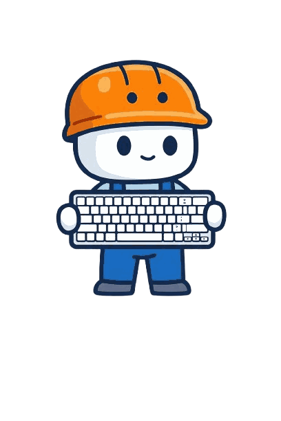


캐릭터는 나름 귀엽게 잘 뽑혔다고 생각했다.
DESIGN.md 마지막 버전
Apple 분석본을 폐기하면서, 같은 포맷으로 Pegman 버전 DESIGN.md 를 직접 썼다. getdesign.md 에서 받은 파일을 베이스로 내 입맛에 맞게 수정한 것이다.
---
version: alpha
name: Pegman-workshop
description: A character-led utility site where Pegman — a hardhat-wearing
  handyman mascot — greets, steps aside, and returns. Built on a warm cream
  workshop canvas with white tool-cards, dual accents (Safety Orange for
  action, Cobalt for structure), and IBM Plex's humanist sans-serif voice.
  UI feels like tools laid out on a craftsman's pegboard, not a luxury catalog.

colors:
  # Brand
  primary: '#F88008' # Safety Orange — every action signal
  cobalt: '#1068C0' # Structural blue — nav, links, secondary
  navy: '#082048' # Pegman outline = primary ink + headlines

  # Surfaces
  canvas: '#F4ECD8' # site default — cream pegboard with enough lift for white cards
  canvas-soft: '#FCFCE8' # Pegman's native habitat — hero halo only
  card: '#FFFFFF' # white tool-cards, inputs, ads
  hairline: '#E8E2CB' # cream-toned border, never cool gray
  # …(중략)…

  # Ink
  ink: '#082048' # = navy, primary text + headlines
  on-primary: '#FFFFFF' # label on filled orange — owner-approved brand choice, ≈2.6:1 (below AA)
  # …(중략)…

typography:
  hero-display:
    fontFamily: '"IBM Plex Sans", "IBM Plex Sans KR", "IBM Plex Sans JP", …'
    fontSize: 56px
    fontWeight: 600
    lineHeight: 1.1
  # …(토큰 13개 중략)…

mascot:
  category-masters:
    text: 'pegman-text.png' # notepad + pencil
    convert: 'pegman-convert.png' # </> code-arrow icon
    format: 'pegman-format.png' # wrench
    time: 'pegman-time.png' # flowchart / clock
    calc: 'pegman-calc.png' # calculator
    code: 'pegman-code.png' # keyboard
  state-poses:
    default: 'pegman-default.png' # neutral standing pose
    empty: 'pegman-empty.png' # hands on hips, looking at empty workbench
    success: 'pegman-success.png' # thumbs up
    error: 'pegman-error.png' # scratching head
    loading: 'pegman-loading.png' # hammering — animatable via CSS
  prop-color-rule: 'character body palette is brand-fixed (navy outline /
    orange helmet / cobalt overalls / white body); held props may use natural
    colors as small accents, area ≤ 30% of character'

components:
  option-chip:
    selectedBackground: '{colors.primary}' # filled safety orange
    selectedText: '#FFFFFF' # white on safety orange — see tradeoff note
    # Note 2 (selected): navy-on-orange tested as "muddy/dingy"; the owner
    # chose the bright helmet orange + white text for brand consistency,
    # accepting that white on #F88008 is ≈2.6:1 (below AA). All filled-orange
    # controls share this rule (button-primary, badges). Do not propagate
    # white-on-orange to body text or links.
  ad-container:
    pegmanDistance: '≥ 200px (no mascot within ad sightline)'
  # …(컴포넌트 15개 중략)…
---

## Overview

**Pegboard is a workshop, not a museum.** Every page is one tool, hung on a
wall of many. Pegman — the hardhat handyman mascot — greets visitors at the
page hero, steps aside while the tool does its work, then returns at
completion, empty state, or error.

## Voice & Copy

| State   | EN                                      | KO                                 |
| ------- | --------------------------------------- | ---------------------------------- |
| empty   | Empty workshop — paste something above. | 빈 작업대네요. 위 칸에 붙여보세요. |
| success | All set.                                | 정리됐어요.                        |
| error   | Hmm, I don't recognize this.            | 어, 이 형식은 잘 모르겠어요.       |
| 404     | This peg is empty.                      | 이 페그는 비어 있네요.             |

## Do's and Don'ts

- Don't put Pegman inside the tool card while the user is working — that's
  the Clippy trap. Pegman returns at empty, success, error, not during input.
- Don't put Pegman within 200px of an ad container.
- Don't translate "Pegman" — the character name is universal.
세 번째 시스템으로 가는 길목 — shadcn 도입
shadcn 으로 옮기고 싶었던 이유는 하나가 아니라 세 갈래였다.
- IA의 한계. 페이지가 18개로 늘면서 이 페이지를 효과적으로 노출할 UI가 필요해졌다. shadcn 문서처럼 _좌측 사이드바 카테고리 내비_로 옮기고 싶어졌다.
- 굳이 토큰을 태워서 바퀴를 재발명? 버튼, 입력창, 셀렉트 같은 평범한 컴포넌트를 AI 에이전트에게 만들게 하면 — 토큰이 들고, 시간이 들고, 검수가 든다. 그런데 그 결과물은 어차피 shadcn 이 이미 잘 만들어 둔 것의 아류다. 컴포넌트를 만드는 데 굳이 AI 토큰과 시간을 쓸 필요가 있을까? 검증된 컴포넌트를 복사해 오면 그 토큰으로 도구를 하나 더 만들 수 있다.
- 일관성의 균열. 에이전트가 페이지마다 컴포넌트를 조금씩 다르게 빚는 일이 실제로 있었다. 패딩이 미묘하게 다르고, 포커스 링이 다르고. 페이지가 적은 지금이야 잡으면 그만이지만, 100페이지가 되면 이건 디테일 이슈가 아니라 하나의 장르가 된다. 레포가 소유하는 단일 컴포넌트 셋으로 미리 묶어둬야 했다.
그래서 그동안 만들었던 디자인 시스템을 전부 폐기했다.
DESIGN.md 파일도 삭제하고 shadcn 시스템을 기반으로 모든 페이지를 재구축했다.
"삭제"가 아니라 "미노출" — Pegman 은 대기발령 중
하지만 Pegman은 아예 삭제된 것은 아니다.
Favicon, og 이미지에는 아직 사용하고 있고, Pegman 캐릭터는 조금씩 활용해서 pegboard.me 웹사이트를 꾸며나갈 예정이다.
Sources / 참고:
- getdesign.md — 구글이 발표한
DESIGN.md형식으로 유명 브랜드 디자인 시스템을 분석·제공 - shadcn/ui — 레포가 소유하는 컴포넌트 라이브러리